


This article is the engrish translation of the last of a 7 parts series. Sorry my bad French, yell any corrections by commenting, thanks.
In the previous post, i've explained why bothering the display of an image according to the logical/physical pixel ratio of the support (a problem dating since you were able to print a page in Netscape 1) and showed some hacks to do so. Let's see the W3C proposal, why it bother me… and let's try to build a better thing.

Within W3C communities, the Responsive Image working group is trying to build an elegant and standard solution to that very one problem. After lot of conversations came the <img srcset="" /> attribute. Its function is to change on the fly the source named in src="" according to different display rules, including the pixel density. It was the only concern of the first proposal.
srcset="" according to its documentation
Warning : This attribute is still in its infancy, neither its syntax or implementation are fixed, its most up-to-date version is actually published at the Responsive Image Community Group. Today, you must use it with the same precautions as an experiment and as if it was prefixed in javascript or css, as this kind of experimentation syntax is, alas, still missing in html.
The content of this attribute is a list, comma-separated. Each entry of the list is an url source, then a space and application rules like the available width (640w) or the pixel density of the display resolution (4x).
So, i quote here the W3C reference draft, you can get a rule by the containing width :
<img src="pear-desktop.jpeg" srcset="pear-mobile.jpeg 720w, pear-tablet.jpeg 1280w" />
or the logical/physical pixel ratio :
<img src="pear-desktop.jpeg" srcset="pear-mobile.jpeg 2x, pear-tablet.jpeg 4x" />
or both :
<img src="pear-desktop.jpeg" srcset="pear-mobile.jpeg 720w, pear-tablet.jpeg 1280w, pear-desktop.jpeg 1x" />
Yes, we have repetitions and mixed pixel density and responsive webdesign issues. In a so so confusion, you can't be sure what was done, even a mother cat will lost her kitties.

<img src="/vrac/.blog2/webdev/1403-Img/.1406-Img-KittyPrinter_s.jpg" srcset="/vrac/.blog2/webdev/1403-Img/.1406-Img-KittyPrinter_m.jpg 2x , /vrac/.blog2/webdev/1403-Img/1406-Img-KittyPrinter.jpg 4x" alt="" />
« Our kitty printer is running out of toner »
Sure.
A bright idea that might goes dark
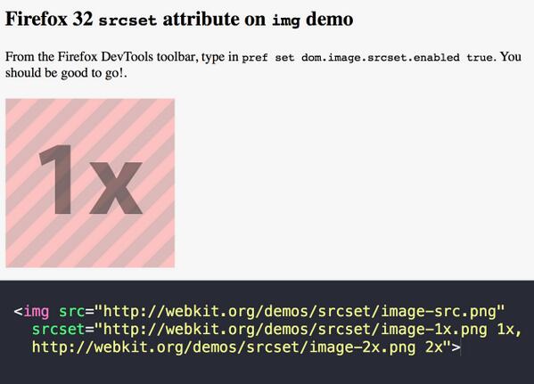
This attribute is already living in some browsers. Well, in fact, mainly Chrome when they were still using webkit. Firefox just installed it in Nightly the last week, so we'll probably got it in Firefox 32 in 3 monthes. Apple made an iOS8 promise and the Microsoft IETeam is still considering it.
Sincerely, when I read that srcset="" is the very best way to manage HiDPI issues, I can't believe it. Geoffroy Crofte from Alsacréations is also concluding that the syntax is not so good. And the question is still bothering for two years.
And reading it again, I fear the very same problem that we already inherited in favicons declarations. The one that give you very bad <head></>-eaches :
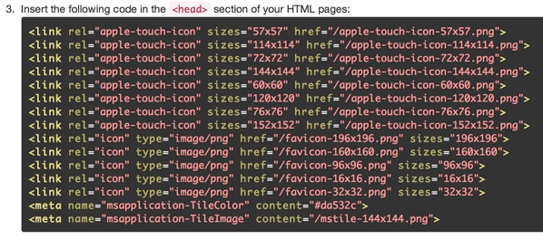
Source : Tweet from @Judofyr
IMHO, this html attribute will be more a problem than resolving one. First of all, it is more about presentation than document semantics itself so pal, why did thou let thy piggy in thy html's dinnin' room ?. Add it the <picture>/</> tag to the recipe, you will get a worrying level of verbosity, but you can avoid it before.
When you know html “conventions” code from Google, so abbreviated that you've got implicit html everywhere, I'm really surprised that Chrome accepts so many repetitions, autant de redites
, redudant informations. Decide or take again a little time for…
Thinking about the current uses of images
Oh please, don't believe I'll chat about sociologically or whatever, I'm talking about assets distribution in a website, as it's done in the state of the Art. In the pictures, we have the ones describing something, and the ones that are insignificant decoration…

Source : the very good writing about this painting in Du bleu dans mes nuages (french speaking) blog
We have four three main image sources :
- the ones called by css, strictly decoration and not intented to be changed by the website users ;
- the ones in
<img />but called via templates or created by DOM manipulations ; the emoji ones, sinked in the text by any hypster who believe living in 原宿 ;-
the ones in
<img />, being sent by users via a CMS (or the front of a social service, or small ads sites) and that are processed in backend (anti-XSS, resizing, watermarking, optimization…).
In the first case, background-image populated, we don't bother about it : CSS media-queries can work in relation with the physical pixel density using resolution, or directly using the .svg furbished by the artist designer.
In the last case lies the srcset="" attribute where it's becoming a complicated nightmare : How to deal with the existing ? How updating all the holdings if newer resolutions must be supported by the website ?
We are obviously more often working with CMS (or so), as the one motoring my blog by example. Creating on the fly lots of sub-formats from any picture accordingly to some programmed parameters is a classical job for any CMS. If you were using direct html edition, you can't easily put this attribute without an important rewrite of all the back-catalog pages. I already see how long it will be for my blog, having 2000 posts in 10 years, and I don't have high-def source for all the illustrations. So think about it for a e-commerce business having dozen of thousands references or any daily newspaper that publish hundred of stories every single day.
(Insert here a joke about your regional newspaper, the one having in front page a “email jokes” category.)
Just take this very single post, hand-made html crafted, and think that every picture I made reference should have multiple definitions, while any sub-formats was automated/normalized by its CMS.
NO F☵⚧⚼☭G NO srcset="" is NOT at all « …a good thing » by that way.
What should the specifications have been
Here are what would be the basic rules in my humble opinion :
- No repetitions, the source URL should not be demultiplicated in the html code, moreover when those URLs are automatically generated. The less verbosity, the more users will use it
- The number of DOM constructed elements should be the lesser
- In being simple, html code should encourage good practices
- Dimensions should be implied, as the browser will know them in decoding the image file, and css may change them presentation constraints. Forcing sizes may lead to unsolvable issues
- All that is about resolution and pixel finesse should be managed by the browser alone. As it is not about semantics but about presentation, any mention of it must be in the CSS
- For being futureproof, adding new sub-formats lied to the resolution must be solved in no more 5 lines, even if you have thousands of pictures.
- The solution must be protocol independent, never asking back-end recoding or parameterizing. Yes, it must work on any dynamic server but also any static one or locally hosted.
- It should be feasible by any lambda webmaster
- And, last bu not the least, it must be easy to implement for browsers' coders, elsewhere don't think about it
If you compare with each trick explained in French in the previous post, you'll see that srcset="" is not so well placed...
So why not using CSS ?

If i moved my ass sooner, chatted in the W3C WG and put my 2 cents, I would have done this proposal : we must be able to change URL source on the fly via a regular expression, as the greatest majority of subformat pictures are automated even in their naming.
OK, but you'll have to implement lot of brand new parts :
Proposal : srcset in css

Source : AngryJulieMonday
The best way is having a resource rule by the pixel density of the screen. So as we have srcset="" implemented in html, why not do it in css ?
srcset : "img-4x.jpg" 4x;
And we can chain other scenarii :
srcset : "img-2x.jpg" 2x , "img-4x.jpg" 4x;
This property would dictate both the substitution and the scale to apply to your image. We would have a generic declaration, more easy to change as you edit css rules, example : when you have to change a responsive design theme. So the width-available notation would be past and forgotten.
As I mean it, if the resource is missing, the property must be ignored.
In CSS, it will be also useful for other tags as <video></> or <iframe></>
Proposal : Using regex into css

I mean, creating a brand new css operator, namely a regex and its replacement pattern. Nearly every browser have a javascript engine, so a standardized regex library. I think this is the biggest piece of work to do, to debate and to code, as we will have to adapt css parsers to accept a brand new unknown syntax for them.
Example : regex(attr(src) , "^/images(.*)/([^/]+)$" , "/images\1/.\2,x2").
First parameter is the string to operate, here the content of the src="" attribute in the html code, the second one is the regex formula, and the third one is the replacement formula. In this example, /images/examples/test.jpg would be substituted by /images/examples/.test.jpg,x2
So, as any integrator, you will just have to describe once the naming strategy of the subformat pictures, if the variation is in the repertory (“/x1/img.jpg”), by internal suffix (“img_x1.jpg”) or final (“img.jpg,x1”).
The relief code would be enormous on most of the websites compared to the srcset=""-in-each-tag strategy.
Proposal : async="no"

If we want to avoid the browser to load the <img src="" /> default resources, then the “good” ones afterwards, we need to flag for the browser that an asset (css or javascript) should not be parsed asynchronously. So having async="no".
Yep. I know.
From my sunny hometown in the South of France, I can hear you shouting that my proposal is a completely stupid and inefficient one, I can see you wanting to thrown rotten fruits to my face, and dialing the Spaninsh Inquisition for a surprise inquiry.
You're
almost right :
This property would help avoiding that the browser load a file that might be invalidated by a stylesheet later. But it goes completely backwards what everyone have done in performance. Yes, there is a abuse risk, but web integrators will learn by failing. And if I don't have a completely messy proposal, I risked to be eared seriously by you.
Currently, the most used solution for that is direct inclusion of js/css in the html source. I can't tell for you, but it hurts my eyes every time I see that.
In fine

Yes i know this is very pretentious to have so many proposals, as a part of them are completely rotten ones. So I have to present each one independently, eventually having them accepted by W3C and WHAT-WG, seeing perhaps implementations in browsers... and fight against their misuses.
Bref. There is work to do, but I believe these proposals would help a lot to get the html syntax less verbose, to ease a lot resource maintenance and to extend easely for the very very high density screen yet to be marketed. I can't believe someone will soon selling me a 3200 dpi screen device…
Just imagine :
article img {

    srcset : regex(attr(src) , "^/images/articles/(.*)/([^/]+)$" , "/images/articles/\1/.\2,x2") x2,

           regex(attr(src) , "^/images/articles/(.*)/([^/]+)$" , "/images/articles/\1/.\2,x4") x4;

}

.decor img {

    srcset : regex(attr(src) , "^/images/layout/(.*)/([^/]+)$" , "/images/layout/\1/.\2,x2") x2,

           regex(attr(src) , "^/images/layout/(.*)/([^/]+)$" , "/images/layout/\1/.\2,x4") x4;

}
Hard to be simplier…
And thank you for all the fish
Writing the whole <img /> tag series was very long, and I cannot claim to be exhaustive or perfect. I have to thank every one that re-read me, advised, or corrected in the comments. Writing on a subject is an occasion to question yourself, to document and having again fun to learn and writing not only crappy puns.
I have to thank a thousand times the srcset="" syntax that gave me inspiration to write on it.
Hope you so ;)